
I’ve been watching this evolve since Fall 2018 . . .
I wrote about coral and pink in combination on my Fb.com/JulieValerieAuthor page last December. If you visit my page, you’ll find two posts written on December 14, 2018, and a follow-up post on March 1, 2019.
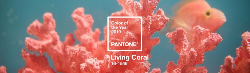
Now that it’s June 2019, I think Pantone’s 16-1546 Living Coral will really take off, trickling into all consumer markets.
Easiest places to spot it: in lipstick, handbags, resort accessories, and home furnishings. Oh, and consumer magazine covers—which’ll also mean book covers releasing late 2019 through 2021. The fact that Delia Owen’s Where the Crawdads Sing is selling so well––will certainly help expose the quieter side of coral to the reading market.
Harder to find, but would be SO COOL: retro-styled refrigerators.
For me . . .
I’d like to see Pantone’s Living Coral in printed paper goods like napkins and stationary—not in “beachy” or “river house” prints liked you’d assume when working with coral, but rather, something unexpected like maybe . . . coral trefoils and quatrefoils as an update to the gold we’ve been living with for years.
That gold foil motif is not going anywhere—it’s always a safe bet, but a touch of coral would freshen.
In upholstery, I see fat-bellied bird silhouettes in coral and white on top of a gray background. Would certainly freshen things up a bit.
Color pairings . . .
- Watch for it paired most often with yellow.
- In a trio, you’ll see: coral, yellow, and a white. The white will have slight gray undertones to mellow the coral.
- In a quad, add minimal (minimal) amounts of black as an accent. Think thin line or small motif.
- A natural fit for most consumers will be to pair it with either an aqua blue or a fern green, and in these instances, watch for it to “pop” with a bright white. This is the “assumed” color combination that will sell better in the mass market than the more fashion-forward coral, yellow, grayed white trio, so rest assured, manufacturers will provide what makes the consumer feel most safe.
Any way you slice it, it’s a fun color that’s been trending for six months in select markets—but now that warmer months prevail, it’ll be everywhere. You watch.
Hop on Pinterest to see my Living Coral board.
Here’s a sneak peek:

Visit me on Pinterest at pinterest.com/Julie_Valerie